 424d2f6965
## Description
This PR upgrades Prettier to v2 + enforces TypeScript’s [`import
type`](https://www.typescriptlang.org/docs/handbook/release-notes/typescript-3-8.html#type-only-imports-and-export)
syntax where applicable. It’s submitted as a separate PR so we can merge
it easily.
As a part of this PR, we reformat the codebase heavily:
- add `import type` everywhere where it’s required, and
- re-format the code to account for Prettier 2’s breaking changes:
https://prettier.io/blog/2020/03/21/2.0.0.html#breaking-changes
This PR is submitted against `release` to make sure all new code by team
members will adhere to new formatting standards, and we’ll have fewer
conflicts when merging `bundle-optimizations` into `release`. (I’ll
merge `release` back into `bundle-optimizations` once this PR is
merged.)
### Why is this needed?
This PR is needed because, for the Lodash optimization from
7cbb12af88,
we need to use `import type`. Otherwise, `babel-plugin-lodash` complains
that `LoDashStatic` is not a lodash function.
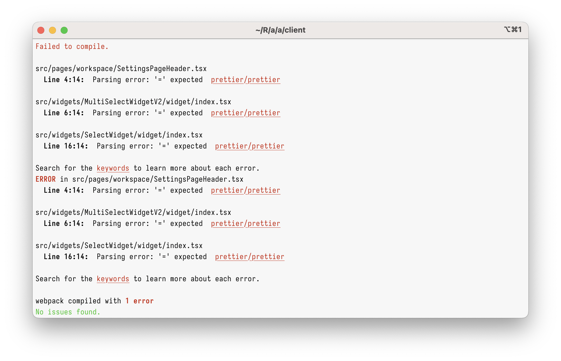
However, just using `import type` in the current codebase will give you
this:
<img width="962" alt="Screenshot 2023-03-08 at 17 45 59"
src="https://user-images.githubusercontent.com/2953267/223775744-407afa0c-e8b9-44a1-90f9-b879348da57f.png">
That’s because Prettier 1 can’t parse `import type` at all. To parse it,
we need to upgrade to Prettier 2.
### Why enforce `import type`?
Apart from just enabling `import type` support, this PR enforces
specifying `import type` everywhere it’s needed. (Developers will get
immediate TypeScript and ESLint errors when they forget to do so.)
I’m doing this because I believe `import type` improves DX and makes
refactorings easier.
Let’s say you had a few imports like below. Can you tell which of these
imports will increase the bundle size? (Tip: it’s not all of them!)
```ts
// app/client/src/workers/Linting/utils.ts
import { Position } from "codemirror";
import { LintError as JSHintError, LintOptions } from "jshint";
import { get, isEmpty, isNumber, keys, last, set } from "lodash";
```
It’s pretty hard, right?
What about now?
```ts
// app/client/src/workers/Linting/utils.ts
import type { Position } from "codemirror";
import type { LintError as JSHintError, LintOptions } from "jshint";
import { get, isEmpty, isNumber, keys, last, set } from "lodash";
```
Now, it’s clear that only `lodash` will be bundled.
This helps developers to see which imports are problematic, but it
_also_ helps with refactorings. Now, if you want to see where
`codemirror` is bundled, you can just grep for `import \{.*\} from
"codemirror"` – and you won’t get any type-only imports.
This also helps (some) bundlers. Upon transpiling, TypeScript erases
type-only imports completely. In some environment (not ours), this makes
the bundle smaller, as the bundler doesn’t need to bundle type-only
imports anymore.
## Type of change
- Chore (housekeeping or task changes that don't impact user perception)
## How Has This Been Tested?
This was tested to not break the build.
### Test Plan
> Add Testsmith test cases links that relate to this PR
### Issues raised during DP testing
> Link issues raised during DP testing for better visiblity and tracking
(copy link from comments dropped on this PR)
## Checklist:
### Dev activity
- [x] My code follows the style guidelines of this project
- [ ] I have performed a self-review of my own code
- [ ] I have commented my code, particularly in hard-to-understand areas
- [ ] I have made corresponding changes to the documentation
- [x] My changes generate no new warnings
- [ ] I have added tests that prove my fix is effective or that my
feature works
- [ ] New and existing unit tests pass locally with my changes
- [ ] PR is being merged under a feature flag
### QA activity:
- [ ] Test plan has been approved by relevant developers
- [ ] Test plan has been peer reviewed by QA
- [ ] Cypress test cases have been added and approved by either SDET or
manual QA
- [ ] Organized project review call with relevant stakeholders after
Round 1/2 of QA
- [ ] Added Test Plan Approved label after reveiwing all Cypress test
---------
Co-authored-by: Satish Gandham <hello@satishgandham.com>
Co-authored-by: Satish Gandham <satish.iitg@gmail.com>
176 lines
4.4 KiB
TypeScript
176 lines
4.4 KiB
TypeScript
import * as React from "react";
|
|
import { useState } from "react";
|
|
import styled from "styled-components";
|
|
import type { ControlProps } from "./BaseControl";
|
|
import BaseControl from "./BaseControl";
|
|
import type { ControlType } from "constants/PropertyControlConstants";
|
|
import { BaseButton } from "components/designSystems/appsmith/BaseButton";
|
|
import { ButtonVariantTypes } from "components/constants";
|
|
import { Colors } from "constants/Colors";
|
|
import type { SetProgress } from "design-system-old";
|
|
import { FilePickerV2, FileType } from "design-system-old";
|
|
import type { WrappedFieldInputProps, WrappedFieldMetaProps } from "redux-form";
|
|
import { Field } from "redux-form";
|
|
import { DialogComponent } from "design-system-old";
|
|
import { useEffect, useCallback } from "react";
|
|
import { replayHighlightClass } from "globalStyles/portals";
|
|
|
|
const StyledDiv = styled.div`
|
|
flex: 1;
|
|
border: 1px solid #d3dee3;
|
|
border-right: none;
|
|
padding: 6px 12px;
|
|
font-size: 14px;
|
|
color: #768896;
|
|
white-space: nowrap;
|
|
text-overflow: ellipsis;
|
|
overflow: hidden;
|
|
`;
|
|
|
|
const SelectButton = styled(BaseButton)`
|
|
&&&& {
|
|
max-width: 59px;
|
|
margin: 0 0px;
|
|
min-height: 32px;
|
|
border-radius: 0px;
|
|
font-weight: bold;
|
|
background-color: #fff;
|
|
border-color: ${Colors.PRIMARY_ORANGE} !important;
|
|
font-size: 14px;
|
|
&.bp3-button {
|
|
padding: 6px 0px;
|
|
flex-shrink: 0;
|
|
}
|
|
span {
|
|
color: ${Colors.PRIMARY_ORANGE} !important;
|
|
font-weight: 400;
|
|
}
|
|
&:hover:enabled,
|
|
&:active:enabled {
|
|
background: rgba(248, 106, 43, 0.1) !important;
|
|
}
|
|
}
|
|
`;
|
|
|
|
const FilePickerWrapper = styled.div`
|
|
width: 100%;
|
|
display: flex;
|
|
align-items: center;
|
|
justify-content: center;
|
|
`;
|
|
|
|
type RenderFilePickerProps = FilePickerControlProps & {
|
|
input?: WrappedFieldInputProps;
|
|
meta?: WrappedFieldMetaProps;
|
|
disabled?: boolean;
|
|
onChange: (event: any) => void;
|
|
};
|
|
|
|
function RenderFilePicker(props: RenderFilePickerProps) {
|
|
const [isOpen, setIsOpen] = useState(false);
|
|
const [appFileToBeUploaded, setAppFileToBeUploaded] = useState<{
|
|
file: File;
|
|
setProgress: SetProgress;
|
|
} | null>(null);
|
|
|
|
const FileUploader = useCallback(
|
|
async (file: File, setProgress: SetProgress) => {
|
|
if (!!file) {
|
|
setAppFileToBeUploaded({
|
|
file,
|
|
setProgress,
|
|
});
|
|
} else {
|
|
setAppFileToBeUploaded(null);
|
|
}
|
|
},
|
|
[],
|
|
);
|
|
|
|
const onRemoveFile = useCallback(() => setAppFileToBeUploaded(null), []);
|
|
|
|
useEffect(() => {
|
|
if (appFileToBeUploaded?.file) {
|
|
const reader = new FileReader();
|
|
reader.readAsDataURL(appFileToBeUploaded?.file);
|
|
reader.onloadend = () => {
|
|
const base64data = reader.result;
|
|
props.input?.onChange({
|
|
name: appFileToBeUploaded?.file.name,
|
|
base64Content: base64data,
|
|
});
|
|
};
|
|
}
|
|
}, [appFileToBeUploaded]);
|
|
|
|
return (
|
|
<>
|
|
<div
|
|
className={replayHighlightClass}
|
|
style={{ flexDirection: "row", display: "flex", width: "20vw" }}
|
|
>
|
|
<StyledDiv title={props?.input?.value?.name}>
|
|
{props?.input?.value?.name}
|
|
</StyledDiv>
|
|
<SelectButton
|
|
buttonStyle="PRIMARY"
|
|
buttonVariant={ButtonVariantTypes.SECONDARY}
|
|
disabled={props.disabled}
|
|
onClick={() => {
|
|
setIsOpen(true);
|
|
}}
|
|
text={"Select"}
|
|
/>
|
|
</div>
|
|
{isOpen ? (
|
|
<DialogComponent
|
|
canOutsideClickClose
|
|
isOpen={isOpen}
|
|
maxHeight={"540px"}
|
|
setModalClose={() => setIsOpen(false)}
|
|
>
|
|
<FilePickerWrapper>
|
|
<FilePickerV2
|
|
delayedUpload
|
|
fileType={FileType.ANY}
|
|
fileUploader={FileUploader}
|
|
onFileRemoved={onRemoveFile}
|
|
/>
|
|
</FilePickerWrapper>
|
|
</DialogComponent>
|
|
) : null}
|
|
</>
|
|
);
|
|
}
|
|
class FilePickerControl extends BaseControl<FilePickerControlProps> {
|
|
constructor(props: FilePickerControlProps) {
|
|
super(props);
|
|
this.state = {
|
|
isOpen: false,
|
|
};
|
|
}
|
|
|
|
render() {
|
|
const { configProperty, disabled } = this.props;
|
|
return (
|
|
<Field
|
|
component={RenderFilePicker}
|
|
disabled={disabled}
|
|
name={configProperty}
|
|
/>
|
|
);
|
|
}
|
|
|
|
getControlType(): ControlType {
|
|
return "FILE_PICKER";
|
|
}
|
|
}
|
|
|
|
export interface FilePickerComponentState {
|
|
isOpen: boolean;
|
|
}
|
|
|
|
export type FilePickerControlProps = ControlProps;
|
|
|
|
export default FilePickerControl;
|