 cd02e171cc
## Description Swapping `word-break: break-all;` to `overflow-wrap: break-word;` in the "Show more" modal. Before 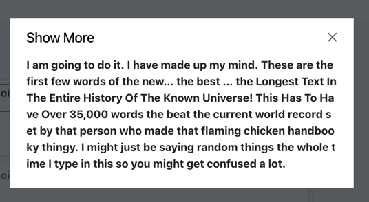 After 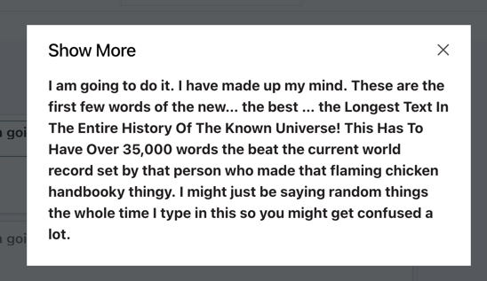 Fixes https://github.com/appsmithorg/appsmith/issues/20413 ## Type of change Bug fix (non-breaking change which fixes an issue) ## How Has This Been Tested? Manual ## Checklist: ### Dev activity - [x] My code follows the style guidelines of this project - [x] I have performed a self-review of my own code - [ ] I have commented my code, particularly in hard-to-understand areas - [ ] I have made corresponding changes to the documentation - [x] My changes generate no new warnings - [ ] I have added tests that prove my fix is effective or that my feature works - [x] New and existing unit tests pass locally with my changes - [ ] PR is being merged under a feature flag ### QA activity: - [ ] Test plan has been approved by relevant developers - [ ] Test plan has been peer reviewed by QA - [ ] Cypress test cases have been added and approved by either SDET or manual QA - [ ] Organized project review call with relevant stakeholders after Round 1/2 of QA - [ ] Added Test Plan Approved label after reveiwing all Cypress test
378 lines
9.7 KiB
TypeScript
378 lines
9.7 KiB
TypeScript
import * as React from "react";
|
|
import { Text } from "@blueprintjs/core";
|
|
import styled from "styled-components";
|
|
import { ComponentProps } from "widgets/BaseComponent";
|
|
import Interweave from "interweave";
|
|
import { UrlMatcher, EmailMatcher } from "interweave-autolink";
|
|
import {
|
|
DEFAULT_FONT_SIZE,
|
|
FontStyleTypes,
|
|
TextSize,
|
|
} from "constants/WidgetConstants";
|
|
import { Icon, IconSize } from "design-system-old";
|
|
import { get } from "lodash";
|
|
import equal from "fast-deep-equal/es6";
|
|
import ModalComponent from "components/designSystems/appsmith/ModalComponent";
|
|
import { Color, Colors } from "constants/Colors";
|
|
import FontLoader from "./FontLoader";
|
|
import { fontSizeUtility } from "widgets/WidgetUtils";
|
|
import { OverflowTypes } from "../constants";
|
|
import LinkFilter from "./filters/LinkFilter";
|
|
|
|
export type TextAlign = "LEFT" | "CENTER" | "RIGHT" | "JUSTIFY";
|
|
|
|
const ELLIPSIS_HEIGHT = 15;
|
|
|
|
export const TextContainer = styled.div`
|
|
& {
|
|
height: 100%;
|
|
width: 100%;
|
|
position: relative;
|
|
}
|
|
ul {
|
|
list-style-type: disc;
|
|
list-style-position: inside;
|
|
}
|
|
ol {
|
|
list-style-type: decimal;
|
|
list-style-position: inside;
|
|
}
|
|
ul ul,
|
|
ol ul {
|
|
list-style-type: circle;
|
|
list-style-position: inside;
|
|
margin-left: 15px;
|
|
}
|
|
ol ol,
|
|
ul ol {
|
|
list-style-type: lower-latin;
|
|
list-style-position: inside;
|
|
margin-left: 15px;
|
|
}
|
|
h1 {
|
|
font-size: 2em;
|
|
margin: 0.67em 0;
|
|
}
|
|
h2 {
|
|
font-size: 1.5em;
|
|
margin: 0.75em 0;
|
|
}
|
|
h3 {
|
|
font-size: 1.17em;
|
|
margin: 0.83em 0;
|
|
}
|
|
h5 {
|
|
font-size: 0.83em;
|
|
margin: 1.5em 0;
|
|
}
|
|
h6 {
|
|
font-size: 0.75em;
|
|
margin: 1.67em 0;
|
|
}
|
|
h1,
|
|
h2,
|
|
h3,
|
|
h4,
|
|
h5,
|
|
h6 {
|
|
font-weight: bold;
|
|
}
|
|
a {
|
|
color: #106ba3;
|
|
text-decoration: none;
|
|
&:hover {
|
|
text-decoration: underline;
|
|
}
|
|
}
|
|
`;
|
|
|
|
const StyledIcon = styled(Icon)<{ backgroundColor?: string }>`
|
|
cursor: pointer;
|
|
bottom: 0;
|
|
left: 0;
|
|
right: 0;
|
|
height: ${ELLIPSIS_HEIGHT}px;
|
|
background: ${(props) =>
|
|
props.backgroundColor ? props.backgroundColor : "transparent"};
|
|
`;
|
|
|
|
type StyledTextProps = React.PropsWithChildren<{
|
|
overflow: OverflowTypes;
|
|
isTruncated: boolean;
|
|
textAlign: string;
|
|
backgroundColor?: string;
|
|
textColor?: string;
|
|
fontStyle?: string;
|
|
fontSize?: TextSize;
|
|
}>;
|
|
|
|
export const StyledText = styled(Text)<StyledTextProps>`
|
|
height: ${(props) =>
|
|
props.overflow === OverflowTypes.TRUNCATE
|
|
? `calc(100% - ${ELLIPSIS_HEIGHT}px)`
|
|
: "100%"};
|
|
overflow-x: hidden;
|
|
overflow-y: ${(props) =>
|
|
props.overflow !== OverflowTypes.SCROLL ||
|
|
props.overflow === OverflowTypes.TRUNCATE.valueOf()
|
|
? "hidden"
|
|
: "auto"};
|
|
text-overflow: ellipsis;
|
|
&& div {
|
|
display: block;
|
|
width: 100%;
|
|
}
|
|
display: flex;
|
|
width: 100%;
|
|
justify-content: flex-start;
|
|
flex-direction: ${(props) => (props.isTruncated ? "column" : "unset")};
|
|
align-items: ${(props) =>
|
|
props.overflow === OverflowTypes.SCROLL ||
|
|
props.overflow === OverflowTypes.TRUNCATE
|
|
? "flex-start"
|
|
: "center"};
|
|
background: ${(props) => props?.backgroundColor};
|
|
color: ${(props) => props?.textColor};
|
|
font-style: ${(props) =>
|
|
props?.fontStyle?.includes(FontStyleTypes.ITALIC) ? "italic" : ""};
|
|
text-decoration: ${(props) =>
|
|
props?.fontStyle?.includes(FontStyleTypes.UNDERLINE) ? "underline" : ""};
|
|
font-weight: ${(props) =>
|
|
props?.fontStyle?.includes(FontStyleTypes.BOLD) ? "bold" : "normal"};
|
|
font-size: ${({ fontSize }) =>
|
|
fontSizeUtility(fontSize) || DEFAULT_FONT_SIZE};
|
|
word-break: break-word;
|
|
span {
|
|
width: 100%;
|
|
line-height: 1.2;
|
|
white-space: pre-wrap;
|
|
text-align: ${(props) => props.textAlign.toLowerCase()};
|
|
}
|
|
`;
|
|
|
|
const ModalContent = styled.div<{
|
|
backgroundColor?: string;
|
|
}>`
|
|
background: ${(props) => props?.backgroundColor || Colors.WHITE};
|
|
padding: 24px;
|
|
padding-top: 16px;
|
|
`;
|
|
|
|
const Heading = styled.div`
|
|
display: flex;
|
|
justify-content: space-between;
|
|
align-items: center;
|
|
.title {
|
|
font-weight: 500;
|
|
font-size: 20px;
|
|
line-height: 24px;
|
|
letter-spacing: -0.24px;
|
|
color: ${Colors.GREY_10};
|
|
}
|
|
.icon > svg > path {
|
|
stroke: ${Colors.GREY_9};
|
|
}
|
|
`;
|
|
|
|
const Content = styled.div<{
|
|
fontSize?: TextSize;
|
|
fontStyle?: string;
|
|
textAlign: string;
|
|
textColor?: string;
|
|
}>`
|
|
padding-top: 16px;
|
|
color: ${(props) => props?.textColor};
|
|
max-height: 70vh;
|
|
overflow: auto;
|
|
overflow-wrap: break-word;
|
|
text-align: ${(props) => props.textAlign.toLowerCase()};
|
|
font-style: ${(props) =>
|
|
props?.fontStyle?.includes(FontStyleTypes.ITALIC) ? "italic" : ""};
|
|
text-decoration: ${(props) =>
|
|
props?.fontStyle?.includes(FontStyleTypes.UNDERLINE) ? "underline" : ""};
|
|
font-weight: ${(props) =>
|
|
props?.fontStyle?.includes(FontStyleTypes.BOLD) ? "bold" : "normal"};
|
|
font-size: ${({ fontSize }) =>
|
|
fontSizeUtility(fontSize) || DEFAULT_FONT_SIZE};
|
|
`;
|
|
export interface TextComponentProps extends ComponentProps {
|
|
accentColor: string;
|
|
text?: string;
|
|
textAlign: TextAlign;
|
|
ellipsize?: boolean;
|
|
fontSize?: TextSize;
|
|
fontFamily: string;
|
|
isLoading: boolean;
|
|
backgroundColor?: string;
|
|
textColor?: string;
|
|
fontStyle?: string;
|
|
disableLink: boolean;
|
|
truncateButtonColor?: string;
|
|
borderColor?: Color;
|
|
borderWidth?: number;
|
|
overflow: OverflowTypes;
|
|
// helpers to detect and re-calculate content width
|
|
bottomRow?: number;
|
|
leftColumn?: number;
|
|
rightColumn?: number;
|
|
topRow?: number;
|
|
}
|
|
|
|
type State = {
|
|
isTruncated: boolean;
|
|
showModal: boolean;
|
|
};
|
|
|
|
type TextRef = React.Ref<Text> | undefined;
|
|
|
|
class TextComponent extends React.Component<TextComponentProps, State> {
|
|
state = {
|
|
isTruncated: false,
|
|
showModal: false,
|
|
};
|
|
|
|
textRef = React.createRef() as TextRef;
|
|
|
|
getTruncate = (element: any) => {
|
|
const { isTruncated } = this.state;
|
|
// add ELLIPSIS_HEIGHT and check content content is overflowing or not
|
|
return (
|
|
element.scrollHeight >
|
|
element.offsetHeight + (isTruncated ? ELLIPSIS_HEIGHT : 0)
|
|
);
|
|
};
|
|
|
|
componentDidMount = () => {
|
|
const textRef = get(this.textRef, "current.textRef");
|
|
if (textRef && this.props.overflow === OverflowTypes.TRUNCATE) {
|
|
const isTruncated = this.getTruncate(textRef);
|
|
this.setState({ isTruncated });
|
|
}
|
|
};
|
|
|
|
componentDidUpdate = (prevProps: TextComponentProps) => {
|
|
if (!equal(prevProps, this.props)) {
|
|
if (this.props.overflow === OverflowTypes.TRUNCATE) {
|
|
const textRef = get(this.textRef, "current.textRef");
|
|
if (textRef) {
|
|
const isTruncated = this.getTruncate(textRef);
|
|
this.setState({ isTruncated });
|
|
}
|
|
} else if (
|
|
prevProps.overflow === OverflowTypes.TRUNCATE &&
|
|
this.props.overflow !== OverflowTypes.TRUNCATE.valueOf()
|
|
) {
|
|
this.setState({ isTruncated: false });
|
|
}
|
|
}
|
|
};
|
|
|
|
handleModelOpen = () => {
|
|
this.setState({ showModal: true });
|
|
};
|
|
|
|
handleModelClose = () => {
|
|
this.setState({ showModal: false });
|
|
};
|
|
|
|
render() {
|
|
const {
|
|
accentColor,
|
|
backgroundColor,
|
|
disableLink,
|
|
ellipsize,
|
|
fontSize,
|
|
fontStyle,
|
|
overflow,
|
|
text,
|
|
textAlign,
|
|
textColor,
|
|
truncateButtonColor,
|
|
} = this.props;
|
|
|
|
return (
|
|
<>
|
|
<FontLoader fontFamily={this.props.fontFamily}>
|
|
<TextContainer>
|
|
<StyledText
|
|
backgroundColor={backgroundColor}
|
|
className={this.props.isLoading ? "bp3-skeleton" : "bp3-ui-text"}
|
|
ellipsize={ellipsize}
|
|
fontSize={fontSize}
|
|
fontStyle={fontStyle}
|
|
isTruncated={this.state.isTruncated}
|
|
overflow={overflow}
|
|
ref={this.textRef}
|
|
textAlign={textAlign}
|
|
textColor={textColor}
|
|
>
|
|
<Interweave
|
|
content={text}
|
|
filters={[new LinkFilter()]}
|
|
matchers={
|
|
disableLink
|
|
? []
|
|
: [new EmailMatcher("email"), new UrlMatcher("url")]
|
|
}
|
|
newWindow
|
|
/>
|
|
</StyledText>
|
|
{this.state.isTruncated && (
|
|
<StyledIcon
|
|
backgroundColor={backgroundColor}
|
|
className="t--widget-textwidget-truncate"
|
|
fillColor={truncateButtonColor || accentColor}
|
|
name="context-menu"
|
|
onClick={this.handleModelOpen}
|
|
size={IconSize.XXXL}
|
|
/>
|
|
)}
|
|
</TextContainer>
|
|
</FontLoader>
|
|
<ModalComponent
|
|
canEscapeKeyClose
|
|
canOutsideClickClose
|
|
className="t--widget-textwidget-truncate-modal"
|
|
hasBackDrop
|
|
isOpen={this.state.showModal}
|
|
onClose={this.handleModelClose}
|
|
overlayClassName="text-widget-truncate"
|
|
scrollContents
|
|
width={500}
|
|
>
|
|
<ModalContent backgroundColor={backgroundColor}>
|
|
<Heading>
|
|
<div className="title">Show More</div>
|
|
<Icon
|
|
className="icon"
|
|
name="cross"
|
|
onClick={this.handleModelClose}
|
|
size={IconSize.MEDIUM}
|
|
/>
|
|
</Heading>
|
|
<Content
|
|
fontSize={fontSize}
|
|
fontStyle={fontStyle}
|
|
textAlign={textAlign}
|
|
textColor={textColor}
|
|
>
|
|
<Interweave
|
|
content={text}
|
|
filters={[new LinkFilter()]}
|
|
matchers={
|
|
disableLink
|
|
? []
|
|
: [new EmailMatcher("email"), new UrlMatcher("url")]
|
|
}
|
|
newWindow
|
|
/>
|
|
</Content>
|
|
</ModalContent>
|
|
</ModalComponent>
|
|
</>
|
|
);
|
|
}
|
|
}
|
|
|
|
export default TextComponent;
|