 424d2f6965
## Description
This PR upgrades Prettier to v2 + enforces TypeScript’s [`import
type`](https://www.typescriptlang.org/docs/handbook/release-notes/typescript-3-8.html#type-only-imports-and-export)
syntax where applicable. It’s submitted as a separate PR so we can merge
it easily.
As a part of this PR, we reformat the codebase heavily:
- add `import type` everywhere where it’s required, and
- re-format the code to account for Prettier 2’s breaking changes:
https://prettier.io/blog/2020/03/21/2.0.0.html#breaking-changes
This PR is submitted against `release` to make sure all new code by team
members will adhere to new formatting standards, and we’ll have fewer
conflicts when merging `bundle-optimizations` into `release`. (I’ll
merge `release` back into `bundle-optimizations` once this PR is
merged.)
### Why is this needed?
This PR is needed because, for the Lodash optimization from
7cbb12af88,
we need to use `import type`. Otherwise, `babel-plugin-lodash` complains
that `LoDashStatic` is not a lodash function.
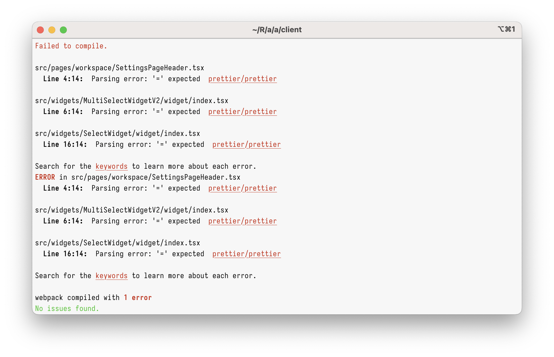
However, just using `import type` in the current codebase will give you
this:
<img width="962" alt="Screenshot 2023-03-08 at 17 45 59"
src="https://user-images.githubusercontent.com/2953267/223775744-407afa0c-e8b9-44a1-90f9-b879348da57f.png">
That’s because Prettier 1 can’t parse `import type` at all. To parse it,
we need to upgrade to Prettier 2.
### Why enforce `import type`?
Apart from just enabling `import type` support, this PR enforces
specifying `import type` everywhere it’s needed. (Developers will get
immediate TypeScript and ESLint errors when they forget to do so.)
I’m doing this because I believe `import type` improves DX and makes
refactorings easier.
Let’s say you had a few imports like below. Can you tell which of these
imports will increase the bundle size? (Tip: it’s not all of them!)
```ts
// app/client/src/workers/Linting/utils.ts
import { Position } from "codemirror";
import { LintError as JSHintError, LintOptions } from "jshint";
import { get, isEmpty, isNumber, keys, last, set } from "lodash";
```
It’s pretty hard, right?
What about now?
```ts
// app/client/src/workers/Linting/utils.ts
import type { Position } from "codemirror";
import type { LintError as JSHintError, LintOptions } from "jshint";
import { get, isEmpty, isNumber, keys, last, set } from "lodash";
```
Now, it’s clear that only `lodash` will be bundled.
This helps developers to see which imports are problematic, but it
_also_ helps with refactorings. Now, if you want to see where
`codemirror` is bundled, you can just grep for `import \{.*\} from
"codemirror"` – and you won’t get any type-only imports.
This also helps (some) bundlers. Upon transpiling, TypeScript erases
type-only imports completely. In some environment (not ours), this makes
the bundle smaller, as the bundler doesn’t need to bundle type-only
imports anymore.
## Type of change
- Chore (housekeeping or task changes that don't impact user perception)
## How Has This Been Tested?
This was tested to not break the build.
### Test Plan
> Add Testsmith test cases links that relate to this PR
### Issues raised during DP testing
> Link issues raised during DP testing for better visiblity and tracking
(copy link from comments dropped on this PR)
## Checklist:
### Dev activity
- [x] My code follows the style guidelines of this project
- [ ] I have performed a self-review of my own code
- [ ] I have commented my code, particularly in hard-to-understand areas
- [ ] I have made corresponding changes to the documentation
- [x] My changes generate no new warnings
- [ ] I have added tests that prove my fix is effective or that my
feature works
- [ ] New and existing unit tests pass locally with my changes
- [ ] PR is being merged under a feature flag
### QA activity:
- [ ] Test plan has been approved by relevant developers
- [ ] Test plan has been peer reviewed by QA
- [ ] Cypress test cases have been added and approved by either SDET or
manual QA
- [ ] Organized project review call with relevant stakeholders after
Round 1/2 of QA
- [ ] Added Test Plan Approved label after reveiwing all Cypress test
---------
Co-authored-by: Satish Gandham <hello@satishgandham.com>
Co-authored-by: Satish Gandham <satish.iitg@gmail.com>
94 lines
2.4 KiB
TypeScript
94 lines
2.4 KiB
TypeScript
import React from "react";
|
|
import Select from "react-select";
|
|
|
|
import type { WrappedFieldInputProps } from "redux-form";
|
|
import type { SelectComponentsConfig } from "react-select/src/components";
|
|
import { LayersContext } from "constants/Layers";
|
|
import { Colors } from "constants/Colors";
|
|
|
|
export type DropdownProps = {
|
|
options: Array<{
|
|
value: string;
|
|
label?: string;
|
|
}>;
|
|
input: WrappedFieldInputProps;
|
|
placeholder: string;
|
|
width?: number | string;
|
|
isSearchable?: boolean;
|
|
isDisabled?: boolean;
|
|
customSelectStyles?: any;
|
|
maxMenuHeight: number;
|
|
components?: SelectComponentsConfig<any>;
|
|
};
|
|
|
|
const selectStyles = {
|
|
placeholder: (provided: any) => ({
|
|
...provided,
|
|
color: "#a3b3bf",
|
|
}),
|
|
control: (styles: any, state: any) => ({
|
|
...styles,
|
|
width: state.selectProps.width || 100,
|
|
minHeight: "36px",
|
|
border: state.isFocused
|
|
? `var(--appsmith-input-focus-border-color) solid 1px`
|
|
: `${Colors.ALTO2} solid 1px`,
|
|
boxShadow: state.isFocused ? 0 : 0,
|
|
padding: "1px 3px 1px",
|
|
"border-radius": "0px",
|
|
"&:hover": {
|
|
background: "#FAFAFA",
|
|
},
|
|
}),
|
|
indicatorsContainer: (provided: any) => ({
|
|
...provided,
|
|
height: "30px",
|
|
}),
|
|
clearIndicator: (provided: any) => ({
|
|
...provided,
|
|
padding: "5px",
|
|
}),
|
|
dropdownIndicator: (provided: any) => ({
|
|
...provided,
|
|
padding: "5px",
|
|
}),
|
|
indicatorSeparator: () => ({}),
|
|
menu: (provided: any) => ({
|
|
...provided,
|
|
zIndex: 2,
|
|
backgroundColor: Colors.GREY_1,
|
|
borderRadius: 0,
|
|
}),
|
|
menuPortal: (base: any) => ({ ...base, zIndex: 2 }),
|
|
};
|
|
|
|
export function BaseDropdown(props: DropdownProps) {
|
|
const layer = React.useContext(LayersContext);
|
|
const { customSelectStyles, input, placeholder } = props;
|
|
const menuPortalStyle = {
|
|
menuPortal: (styles: any) => ({ ...styles, zIndex: layer.max }),
|
|
};
|
|
|
|
return (
|
|
<Select
|
|
menuPortalTarget={document.body}
|
|
styles={{ ...selectStyles, ...customSelectStyles, ...menuPortalStyle }}
|
|
{...input}
|
|
isDisabled={props.isDisabled}
|
|
isSearchable={props.isSearchable}
|
|
onChange={(value) => input.onChange(value)}
|
|
width={props.width}
|
|
{...props}
|
|
classNamePrefix="appsmith-select"
|
|
menuPlacement="auto"
|
|
placeholder={placeholder}
|
|
/>
|
|
);
|
|
}
|
|
|
|
function Dropdown(props: DropdownProps) {
|
|
return <BaseDropdown {...props} />;
|
|
}
|
|
|
|
export default Dropdown;
|