 424d2f6965
## Description
This PR upgrades Prettier to v2 + enforces TypeScript’s [`import
type`](https://www.typescriptlang.org/docs/handbook/release-notes/typescript-3-8.html#type-only-imports-and-export)
syntax where applicable. It’s submitted as a separate PR so we can merge
it easily.
As a part of this PR, we reformat the codebase heavily:
- add `import type` everywhere where it’s required, and
- re-format the code to account for Prettier 2’s breaking changes:
https://prettier.io/blog/2020/03/21/2.0.0.html#breaking-changes
This PR is submitted against `release` to make sure all new code by team
members will adhere to new formatting standards, and we’ll have fewer
conflicts when merging `bundle-optimizations` into `release`. (I’ll
merge `release` back into `bundle-optimizations` once this PR is
merged.)
### Why is this needed?
This PR is needed because, for the Lodash optimization from
7cbb12af88,
we need to use `import type`. Otherwise, `babel-plugin-lodash` complains
that `LoDashStatic` is not a lodash function.
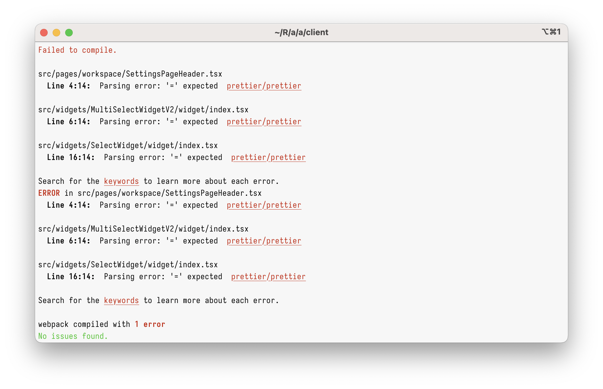
However, just using `import type` in the current codebase will give you
this:
<img width="962" alt="Screenshot 2023-03-08 at 17 45 59"
src="https://user-images.githubusercontent.com/2953267/223775744-407afa0c-e8b9-44a1-90f9-b879348da57f.png">
That’s because Prettier 1 can’t parse `import type` at all. To parse it,
we need to upgrade to Prettier 2.
### Why enforce `import type`?
Apart from just enabling `import type` support, this PR enforces
specifying `import type` everywhere it’s needed. (Developers will get
immediate TypeScript and ESLint errors when they forget to do so.)
I’m doing this because I believe `import type` improves DX and makes
refactorings easier.
Let’s say you had a few imports like below. Can you tell which of these
imports will increase the bundle size? (Tip: it’s not all of them!)
```ts
// app/client/src/workers/Linting/utils.ts
import { Position } from "codemirror";
import { LintError as JSHintError, LintOptions } from "jshint";
import { get, isEmpty, isNumber, keys, last, set } from "lodash";
```
It’s pretty hard, right?
What about now?
```ts
// app/client/src/workers/Linting/utils.ts
import type { Position } from "codemirror";
import type { LintError as JSHintError, LintOptions } from "jshint";
import { get, isEmpty, isNumber, keys, last, set } from "lodash";
```
Now, it’s clear that only `lodash` will be bundled.
This helps developers to see which imports are problematic, but it
_also_ helps with refactorings. Now, if you want to see where
`codemirror` is bundled, you can just grep for `import \{.*\} from
"codemirror"` – and you won’t get any type-only imports.
This also helps (some) bundlers. Upon transpiling, TypeScript erases
type-only imports completely. In some environment (not ours), this makes
the bundle smaller, as the bundler doesn’t need to bundle type-only
imports anymore.
## Type of change
- Chore (housekeeping or task changes that don't impact user perception)
## How Has This Been Tested?
This was tested to not break the build.
### Test Plan
> Add Testsmith test cases links that relate to this PR
### Issues raised during DP testing
> Link issues raised during DP testing for better visiblity and tracking
(copy link from comments dropped on this PR)
## Checklist:
### Dev activity
- [x] My code follows the style guidelines of this project
- [ ] I have performed a self-review of my own code
- [ ] I have commented my code, particularly in hard-to-understand areas
- [ ] I have made corresponding changes to the documentation
- [x] My changes generate no new warnings
- [ ] I have added tests that prove my fix is effective or that my
feature works
- [ ] New and existing unit tests pass locally with my changes
- [ ] PR is being merged under a feature flag
### QA activity:
- [ ] Test plan has been approved by relevant developers
- [ ] Test plan has been peer reviewed by QA
- [ ] Cypress test cases have been added and approved by either SDET or
manual QA
- [ ] Organized project review call with relevant stakeholders after
Round 1/2 of QA
- [ ] Added Test Plan Approved label after reveiwing all Cypress test
---------
Co-authored-by: Satish Gandham <hello@satishgandham.com>
Co-authored-by: Satish Gandham <satish.iitg@gmail.com>
509 lines
15 KiB
TypeScript
509 lines
15 KiB
TypeScript
import type { WidgetType } from "constants/WidgetConstants";
|
|
import { DEFAULT_CENTER } from "constants/WidgetConstants";
|
|
import React from "react";
|
|
import type { WidgetProps, WidgetState } from "widgets/BaseWidget";
|
|
import BaseWidget from "widgets/BaseWidget";
|
|
import MapComponent from "../component";
|
|
|
|
import { EventType } from "constants/AppsmithActionConstants/ActionConstants";
|
|
import { ValidationTypes } from "constants/WidgetValidation";
|
|
import type { Stylesheet } from "entities/AppTheming";
|
|
import { EvaluationSubstitutionType } from "entities/DataTree/dataTreeFactory";
|
|
import styled from "styled-components";
|
|
import { getResponsiveLayoutConfig } from "utils/layoutPropertiesUtils";
|
|
import type { DerivedPropertiesMap } from "utils/WidgetFactory";
|
|
import type { MarkerProps } from "../constants";
|
|
import { getBorderCSSShorthand } from "constants/DefaultTheme";
|
|
|
|
const DisabledContainer = styled.div<{
|
|
borderRadius: string;
|
|
boxShadow?: string;
|
|
}>`
|
|
background-color: white;
|
|
height: 100%;
|
|
text-align: center;
|
|
display: flex;
|
|
flex-direction: column;
|
|
border-radius: ${({ borderRadius }) => borderRadius};
|
|
box-shadow: ${({ boxShadow }) => boxShadow} !important;
|
|
border: ${(props) => getBorderCSSShorthand(props.theme.borders[2])};
|
|
h1 {
|
|
margin-top: 15%;
|
|
margin-bottom: 10%;
|
|
color: #7c7c7c;
|
|
}
|
|
p {
|
|
color: #0a0b0e;
|
|
}
|
|
`;
|
|
|
|
const DefaultCenter = { ...DEFAULT_CENTER, long: DEFAULT_CENTER.lng };
|
|
|
|
type Center = {
|
|
lat: number;
|
|
long: number;
|
|
[x: string]: any;
|
|
};
|
|
|
|
class MapWidget extends BaseWidget<MapWidgetProps, WidgetState> {
|
|
static defaultProps = {};
|
|
|
|
static getPropertyPaneContentConfig() {
|
|
return [
|
|
{
|
|
sectionName: "Data",
|
|
children: [
|
|
{
|
|
propertyName: "mapCenter",
|
|
label: "Initial location",
|
|
helpText:
|
|
"Default location for the map. Search for a location directly in the field.",
|
|
isJSConvertible: true,
|
|
controlType: "LOCATION_SEARCH",
|
|
dependencies: ["googleMapsApiKey"],
|
|
isBindProperty: true,
|
|
isTriggerProperty: false,
|
|
validation: {
|
|
type: ValidationTypes.OBJECT,
|
|
params: {
|
|
allowedKeys: [
|
|
{
|
|
name: "lat",
|
|
type: ValidationTypes.NUMBER,
|
|
params: {
|
|
min: -90,
|
|
max: 90,
|
|
default: 0,
|
|
required: true,
|
|
},
|
|
},
|
|
{
|
|
name: "long",
|
|
type: ValidationTypes.NUMBER,
|
|
params: {
|
|
min: -180,
|
|
max: 180,
|
|
default: 0,
|
|
required: true,
|
|
},
|
|
},
|
|
],
|
|
},
|
|
},
|
|
},
|
|
{
|
|
propertyName: "defaultMarkers",
|
|
label: "Default markers",
|
|
controlType: "INPUT_TEXT",
|
|
inputType: "ARRAY",
|
|
helpText: "Sets the default markers on the map",
|
|
placeholderText: '[{ "lat": "val1", "long": "val2" }]',
|
|
isBindProperty: true,
|
|
isTriggerProperty: false,
|
|
validation: {
|
|
type: ValidationTypes.ARRAY,
|
|
params: {
|
|
children: {
|
|
type: ValidationTypes.OBJECT,
|
|
params: {
|
|
required: true,
|
|
allowedKeys: [
|
|
{
|
|
name: "lat",
|
|
type: ValidationTypes.NUMBER,
|
|
params: {
|
|
min: -90,
|
|
max: 90,
|
|
default: 0,
|
|
required: true,
|
|
},
|
|
},
|
|
{
|
|
name: "long",
|
|
type: ValidationTypes.NUMBER,
|
|
params: {
|
|
min: -180,
|
|
max: 180,
|
|
default: 0,
|
|
required: true,
|
|
},
|
|
},
|
|
{
|
|
name: "title",
|
|
type: ValidationTypes.TEXT,
|
|
},
|
|
{
|
|
name: "color",
|
|
type: ValidationTypes.TEXT,
|
|
},
|
|
],
|
|
},
|
|
},
|
|
},
|
|
},
|
|
evaluationSubstitutionType:
|
|
EvaluationSubstitutionType.SMART_SUBSTITUTE,
|
|
},
|
|
],
|
|
},
|
|
{
|
|
sectionName: "General",
|
|
children: [
|
|
{
|
|
propertyName: "zoomLevel",
|
|
label: "Zoom Level",
|
|
controlType: "STEP",
|
|
helpText: "Changes the default zoom of the map",
|
|
stepType: "ZOOM_PERCENTAGE",
|
|
isBindProperty: false,
|
|
isTriggerProperty: false,
|
|
},
|
|
{
|
|
propertyName: "isVisible",
|
|
label: "Visible",
|
|
helpText: "Controls the visibility of the widget",
|
|
controlType: "SWITCH",
|
|
isJSConvertible: true,
|
|
isBindProperty: true,
|
|
isTriggerProperty: false,
|
|
validation: { type: ValidationTypes.BOOLEAN },
|
|
},
|
|
{
|
|
propertyName: "animateLoading",
|
|
label: "Animate Loading",
|
|
controlType: "SWITCH",
|
|
helpText: "Controls the loading of the widget",
|
|
defaultValue: true,
|
|
isJSConvertible: true,
|
|
isBindProperty: true,
|
|
isTriggerProperty: false,
|
|
validation: { type: ValidationTypes.BOOLEAN },
|
|
},
|
|
{
|
|
propertyName: "enablePickLocation",
|
|
label: "Enable pick location",
|
|
helpText: "Allows a user to pick their location",
|
|
controlType: "SWITCH",
|
|
isBindProperty: false,
|
|
isTriggerProperty: false,
|
|
},
|
|
{
|
|
propertyName: "isClickedMarkerCentered",
|
|
label: "Map & Marker centering",
|
|
helpText:
|
|
"Controls whether the clicked marker is centered on the map",
|
|
controlType: "SWITCH",
|
|
isBindProperty: false,
|
|
isTriggerProperty: false,
|
|
},
|
|
{
|
|
propertyName: "allowClustering",
|
|
label: "Enable clustering",
|
|
controlType: "SWITCH",
|
|
helpText: "Allows markers to be clustered",
|
|
defaultValue: false,
|
|
isJSConvertible: true,
|
|
isBindProperty: true,
|
|
isTriggerProperty: false,
|
|
validation: { type: ValidationTypes.BOOLEAN },
|
|
},
|
|
{
|
|
propertyName: "enableSearch",
|
|
label: "Enable search location",
|
|
helpText: "Allows a user to search for a location",
|
|
controlType: "SWITCH",
|
|
isBindProperty: false,
|
|
isTriggerProperty: false,
|
|
},
|
|
],
|
|
},
|
|
{
|
|
sectionName: "Create Marker",
|
|
children: [
|
|
{
|
|
propertyName: "enableCreateMarker",
|
|
label: "Create new marker",
|
|
helpText: "Allows users to mark locations on the map",
|
|
controlType: "SWITCH",
|
|
isBindProperty: false,
|
|
isTriggerProperty: false,
|
|
},
|
|
{
|
|
propertyName: "onCreateMarker",
|
|
label: "onCreateMarker",
|
|
helpText:
|
|
"When create new marker is enabled, this event triggers upon successful marker creation",
|
|
controlType: "ACTION_SELECTOR",
|
|
isJSConvertible: true,
|
|
isBindProperty: true,
|
|
isTriggerProperty: true,
|
|
hidden: (props: MapWidgetProps) => {
|
|
return !props.enableCreateMarker;
|
|
},
|
|
dependencies: ["enableCreateMarker"],
|
|
},
|
|
],
|
|
},
|
|
...getResponsiveLayoutConfig(this.getWidgetType()),
|
|
{
|
|
sectionName: "Events",
|
|
children: [
|
|
{
|
|
propertyName: "onMarkerClick",
|
|
label: "onMarkerClick",
|
|
helpText: "Triggers an action when the user clicks on the marker",
|
|
controlType: "ACTION_SELECTOR",
|
|
isJSConvertible: true,
|
|
isBindProperty: true,
|
|
isTriggerProperty: true,
|
|
},
|
|
],
|
|
},
|
|
];
|
|
}
|
|
|
|
static getPropertyPaneStyleConfig() {
|
|
return [
|
|
{
|
|
sectionName: "Border and Shadow",
|
|
children: [
|
|
{
|
|
propertyName: "borderRadius",
|
|
label: "Border Radius",
|
|
helpText:
|
|
"Rounds the corners of the icon button's outer border edge",
|
|
controlType: "BORDER_RADIUS_OPTIONS",
|
|
|
|
isJSConvertible: true,
|
|
isBindProperty: true,
|
|
isTriggerProperty: false,
|
|
validation: { type: ValidationTypes.TEXT },
|
|
},
|
|
{
|
|
propertyName: "boxShadow",
|
|
label: "Box Shadow",
|
|
helpText:
|
|
"Enables you to cast a drop shadow from the frame of the widget",
|
|
controlType: "BOX_SHADOW_OPTIONS",
|
|
isJSConvertible: true,
|
|
isBindProperty: true,
|
|
isTriggerProperty: false,
|
|
validation: { type: ValidationTypes.TEXT },
|
|
},
|
|
],
|
|
},
|
|
];
|
|
}
|
|
static getDefaultPropertiesMap(): Record<string, any> {
|
|
return {
|
|
markers: "defaultMarkers",
|
|
center: "mapCenter",
|
|
};
|
|
}
|
|
|
|
static getMetaPropertiesMap(): Record<string, any> {
|
|
return {
|
|
center: undefined,
|
|
markers: undefined,
|
|
selectedMarker: undefined,
|
|
};
|
|
}
|
|
static getDerivedPropertiesMap(): DerivedPropertiesMap {
|
|
return {};
|
|
}
|
|
|
|
static getStylesheetConfig(): Stylesheet {
|
|
return {
|
|
borderRadius: "{{appsmith.theme.borderRadius.appBorderRadius}}",
|
|
boxShadow: "{{appsmith.theme.boxShadow.appBoxShadow}}",
|
|
};
|
|
}
|
|
|
|
updateCenter = (lat?: number, long?: number, title?: string) => {
|
|
this.props.updateWidgetMetaProperty("center", { lat, long, title });
|
|
};
|
|
|
|
updateMarker = (lat: number, long: number, index: number) => {
|
|
const markers: Array<MarkerProps> = [...(this.props.markers || [])].map(
|
|
(marker, i) => {
|
|
if (index === i) {
|
|
marker = { lat, long };
|
|
}
|
|
return marker;
|
|
},
|
|
);
|
|
this.disableDrag(false);
|
|
this.props.updateWidgetMetaProperty("markers", markers);
|
|
};
|
|
|
|
onCreateMarker = (lat?: number, long?: number) => {
|
|
this.disableDrag(true);
|
|
const marker = { lat, long, title: "" };
|
|
|
|
const markers = [];
|
|
(this.props.markers || []).forEach((m) => {
|
|
markers.push(m);
|
|
});
|
|
markers.push(marker);
|
|
this.props.updateWidgetMetaProperty("markers", markers);
|
|
this.props.updateWidgetMetaProperty("selectedMarker", marker, {
|
|
triggerPropertyName: "onCreateMarker",
|
|
dynamicString: this.props.onCreateMarker,
|
|
event: {
|
|
type: EventType.ON_CREATE_MARKER,
|
|
},
|
|
});
|
|
};
|
|
|
|
unselectMarker = () => {
|
|
this.props.updateWidgetMetaProperty("selectedMarker", undefined);
|
|
};
|
|
|
|
onMarkerClick = (lat?: number, long?: number, title?: string) => {
|
|
this.disableDrag(true);
|
|
const selectedMarker = {
|
|
lat: lat,
|
|
long: long,
|
|
title: title,
|
|
};
|
|
this.props.updateWidgetMetaProperty("selectedMarker", selectedMarker, {
|
|
triggerPropertyName: "onMarkerClick",
|
|
dynamicString: this.props.onMarkerClick,
|
|
event: {
|
|
type: EventType.ON_MARKER_CLICK,
|
|
},
|
|
});
|
|
};
|
|
|
|
getCenter(): Center {
|
|
return this.props.center || this.props.mapCenter || DefaultCenter;
|
|
}
|
|
|
|
componentDidUpdate(prevProps: MapWidgetProps) {
|
|
//remove selectedMarker when map initial location is updated
|
|
if (
|
|
JSON.stringify(prevProps.center) !== JSON.stringify(this.props.center) &&
|
|
this.props.selectedMarker
|
|
) {
|
|
this.unselectMarker();
|
|
}
|
|
|
|
// If initial location was changed
|
|
if (
|
|
JSON.stringify(prevProps.mapCenter) !==
|
|
JSON.stringify(this.props.mapCenter)
|
|
) {
|
|
this.props.updateWidgetMetaProperty("center", this.props.mapCenter);
|
|
return;
|
|
}
|
|
|
|
// If markers were changed
|
|
if (
|
|
this.props.markers &&
|
|
this.props.markers.length > 0 &&
|
|
JSON.stringify(prevProps.markers) !== JSON.stringify(this.props.markers)
|
|
) {
|
|
this.props.updateWidgetMetaProperty(
|
|
"center",
|
|
this.props.markers[this.props.markers.length - 1],
|
|
);
|
|
}
|
|
}
|
|
|
|
enableDrag = () => {
|
|
this.disableDrag(false);
|
|
};
|
|
|
|
getPageView() {
|
|
return (
|
|
<>
|
|
{!this.props.googleMapsApiKey && (
|
|
<DisabledContainer
|
|
borderRadius={this.props.borderRadius}
|
|
boxShadow={this.props.boxShadow}
|
|
>
|
|
<h1>{"Map Widget disabled"}</h1>
|
|
<mark>Key: x{this.props.googleMapsApiKey}x</mark>
|
|
<p>{"Map widget requires a Google Maps API Key"}</p>
|
|
<p>
|
|
{"See our"}
|
|
<a
|
|
href="https://docs.appsmith.com/v/v1.2.1/setup/docker/google-maps"
|
|
rel="noopener noreferrer"
|
|
target="_blank"
|
|
>
|
|
{" documentation "}
|
|
</a>
|
|
{"to configure API Keys"}
|
|
</p>
|
|
</DisabledContainer>
|
|
)}
|
|
{this.props.googleMapsApiKey && (
|
|
<MapComponent
|
|
allowClustering={this.props.allowClustering}
|
|
allowZoom={this.props.allowZoom}
|
|
apiKey={this.props.googleMapsApiKey}
|
|
borderRadius={this.props.borderRadius}
|
|
boxShadow={this.props.boxShadow}
|
|
center={this.getCenter()}
|
|
clickedMarkerCentered={this.props.isClickedMarkerCentered}
|
|
enableCreateMarker={this.props.enableCreateMarker}
|
|
enableDrag={this.enableDrag}
|
|
enablePickLocation={this.props.enablePickLocation}
|
|
enableSearch={this.props.enableSearch}
|
|
isDisabled={this.props.isDisabled}
|
|
isVisible={this.props.isVisible}
|
|
markers={this.props.markers}
|
|
saveMarker={this.onCreateMarker}
|
|
selectMarker={this.onMarkerClick}
|
|
selectedMarker={this.props.selectedMarker}
|
|
unselectMarker={this.unselectMarker}
|
|
updateCenter={this.updateCenter}
|
|
updateMarker={this.updateMarker}
|
|
widgetId={this.props.widgetId}
|
|
zoomLevel={this.props.zoomLevel}
|
|
/>
|
|
)}
|
|
</>
|
|
);
|
|
}
|
|
|
|
static getWidgetType(): WidgetType {
|
|
return "MAP_WIDGET";
|
|
}
|
|
}
|
|
|
|
export interface MapWidgetProps extends WidgetProps {
|
|
googleMapsApiKey?: string;
|
|
isDisabled?: boolean;
|
|
isVisible?: boolean;
|
|
enableSearch: boolean;
|
|
zoomLevel: number;
|
|
allowZoom: boolean;
|
|
enablePickLocation: boolean;
|
|
mapCenter: {
|
|
lat: number;
|
|
long: number;
|
|
title?: string;
|
|
};
|
|
center?: {
|
|
lat: number;
|
|
long: number;
|
|
};
|
|
defaultMarkers?: Array<MarkerProps>;
|
|
markers?: Array<MarkerProps>;
|
|
selectedMarker?: {
|
|
lat: number;
|
|
long: number;
|
|
title?: string;
|
|
color?: string;
|
|
};
|
|
onMarkerClick?: string;
|
|
onCreateMarker?: string;
|
|
borderRadius: string;
|
|
boxShadow?: string;
|
|
allowClustering?: boolean;
|
|
}
|
|
|
|
export default MapWidget;
|